


"ICE CUP" Logo Design
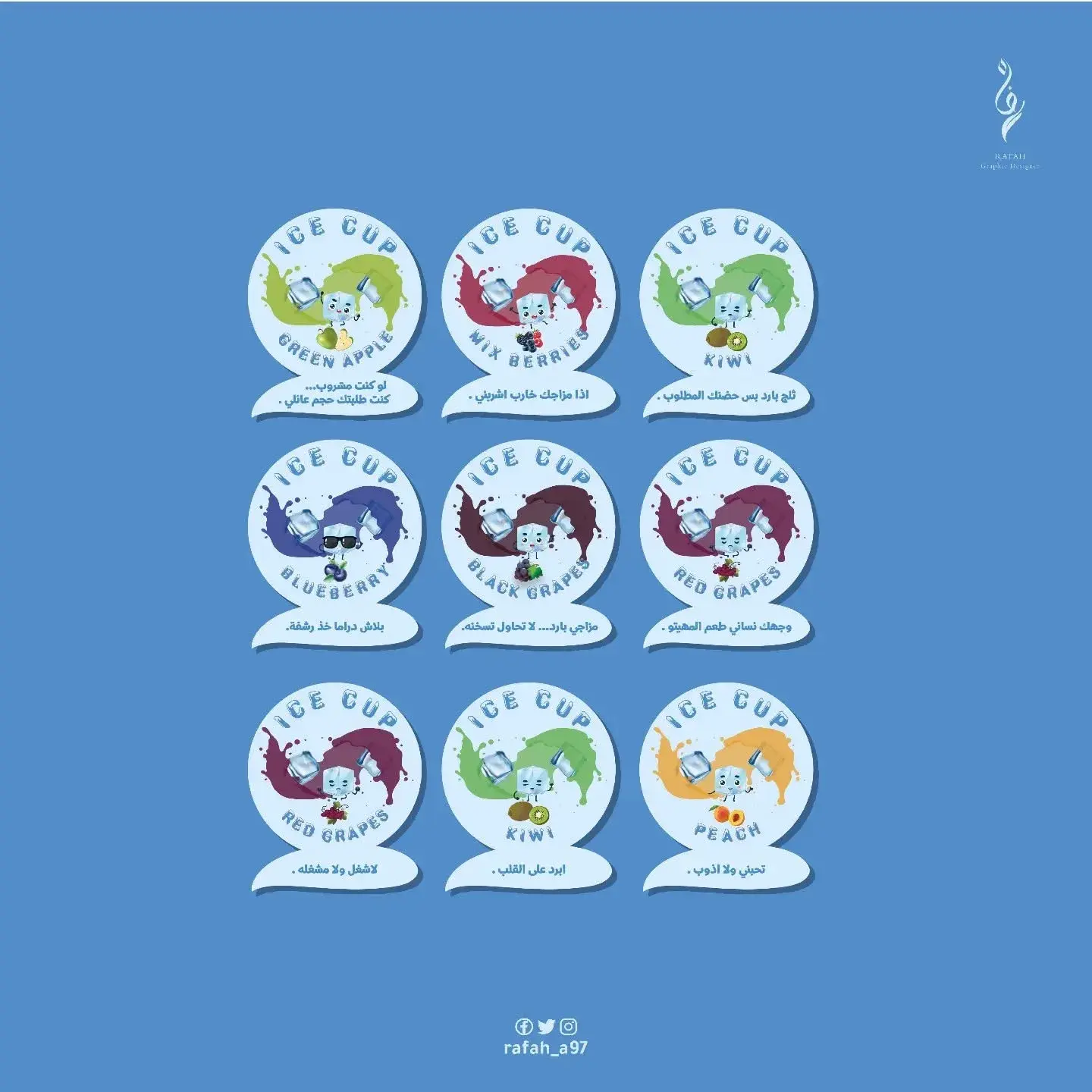
About the Project
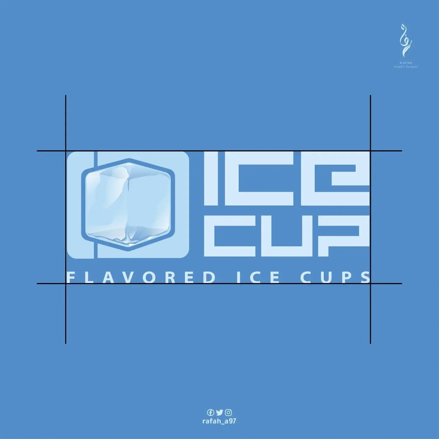
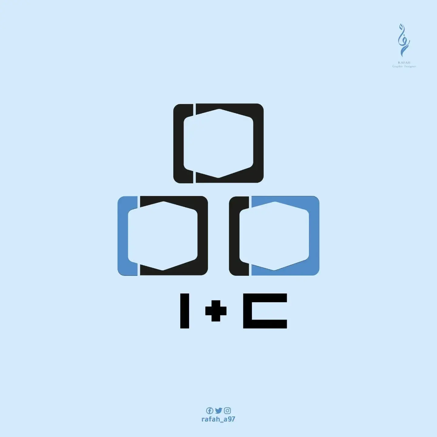
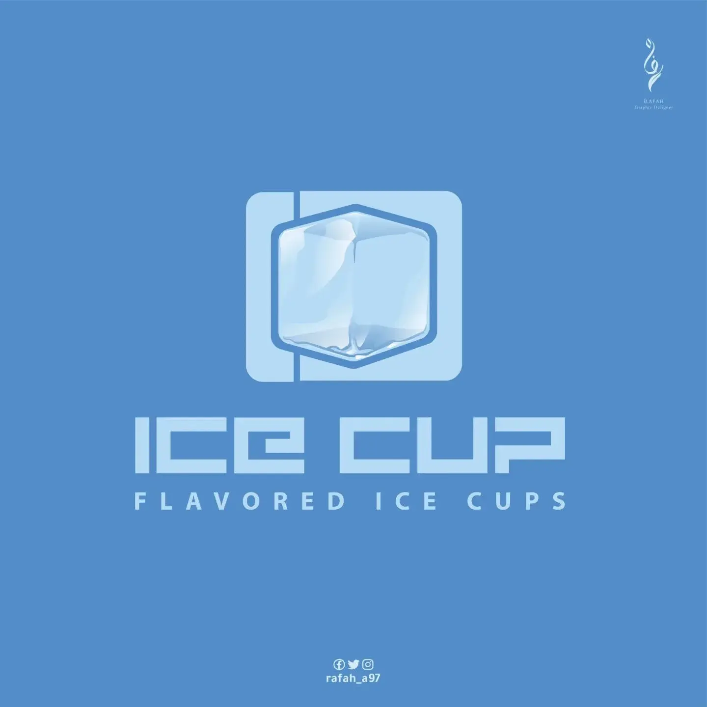
✨ Icon Concept: The icon seamlessly integrates the letter I (as a vertical line) with the letter C serving as the outer frame. The negative space in the center created the perfect canvas for a 3D ice cube—making the entire brand identity rooted in negative space and visual intelligence. 🧊 The Ice Cube: • Soft gradients ranging from light blue to crisp white evoke a feeling of purity and coldness. • Subtle highlights and soft shadows add a realistic, refreshing touch. 🧩 Composition & Structure: • The icon is enclosed within a squircle (rounded square) that subtly hints at the concept of a "cup" or "packaging." • The word ICE at the top and CUP at the bottom utilize a bold, geometric typeface with clean edges for a sleek, modern look. • The tagline FLAVORED ICE CUPS sits beneath to define the product and balance the overall visual composition. 🎯 Brand Meaning: • Monogram Fusion: Simplicity that ensures strong brand recall. • The Ice Cube: Symbolizes freshness and ultimate refreshment. • Geometric Typography: Delivers modernity and high legibility at any scale. 🎨 Color Palette: • Primary Deep Blue: A calm background shade conveying cool temperatures and reliability. • Light / Ice Blue: Applied within the icon gradient to create depth. • Pure White: Used for typography and negative space elements to maximize contrast. 📐 Grid & Alignment: The logo is built on a precise grid system to harmonize spacing, proportion, and baseline alignments—guaranteeing sharp visual clarity on packaging, labels, and digital content. 📦 Versatility & Application: • The standalone icon works seamlessly as a product stamp on cups or as a digital favicon. • The horizontal lockup is optimized for banners, while the stacked layout excels on square formats and social media posts.